My Website

Thursday, January 16, 2014

Looking back at your preliminary task, what do you feel you have learnt in the progression from it to the full product?


This is the last question of my evaluation. To start off with, my first front cover for a school magazine is obviously not as good as my final product. This is because i was only using pixlr at the time and hadn't developed my skills enough at the beginning of the year. Although my preliminary task has a mid shot, logo, title, snippets of information and a colour scheme, it isn't as full as my magazine front cover now. The model in my preliminary task is off to the side therefore making her look less important where as my model in my music magazine is in the middle and using the rule of thirds correctly to what i wished to portray, which was to make him come across as an important figure.

What I've learnt during the development of my music front cover is how to use photoshop, how to create a logo, spacing, different colours of font, creating a slogan, editing the colour and positioning of the image and adding items over the top such as stickers.
I took my original knowledge of singling out one colour in the image but then developed it so I changed the colour as well as singling it out. To do this I singled out the colour and then changed the hue of it to match the colour scheme I wanted. I also learnt to use the 'doodle' application on pixlr to make the background completely white. This helped me out later so the writing of the snippets aren't lost in the background.

I also used a varied amount of fronts on my music front cover, such as the tile, slogan, headings and snippets. I used thicker writing to draw the eye in where as the thinner writing is to add a little bit more information to make the reader want to take a look inside the magazine. This is something I didn't do in my preliminary task. With my school front cover magazine I only used 2 different fonts, this makes the front cover look boring, not as full and doesn't draw your eye as much as my music magazine front cover.

The image quality of the front covers have changed dramatically. With the school magazine front cover I used the school cameras and didn't take the image as big I needed or wanted. When using my own camera the images where taken on the RAW setting which allowed it to be the largest image possible whilst still excellent quality. In both images natural light was used. Being an amateur photographer, I knew in both front covers I needed natural light for the best images. When using non-natural lights on a not so sunny day, the image doesn't appear as nice and more editing had to be used to make it look natural.

Now looking back at the preliminary task I now realise how far I've come and how much my skills have developed.

Wednesday, January 8, 2014

What kind of media institution might distribute your media product and why?


Going back to my 'Publishers' post earlier in the course, I decided that Bauer would be the best institution to publish my magazine due to the fact that they published the magazine Q (which is the magazine I chose to get inspiration for layout from) and are a very successful publisher. 

I studied various other magazine publishers that could have been good for my magazine. Such as, Green Chilly Media produced a number of acoustic instrument magazines and would have been ideal because indie, rock and folk all use acoustic instruments at some point. The reason why I didn't pick Green Chilly Media or Volcano publishings is because they are an independent publishing company and therefor don't have the experience or money that is needed to make my magazine be able to run along side NME, Q and other big music magazine names. 
IPC is similar to Bauer Publishings but doesn't produce as many music magazines as Bauer. The reason why I picked Bauer is because they have more experience in publishing music magazines that IPC. Bauer is a highly successful magazine distributor with one of it's best seller selling over 745,000 copies a month.
Also, this magazine is highly based around acoustic sound and artists, a niche market that needs to be filled by a highly successful magazine publisher such as Bauer.


I then go on to who would publish my magazine. In my 'Publishers' post I went through a few of many places that could easily distribute my music magazine, these including superstores such as Tesco or Asda, and smaller but more spread out businesses like WHSmith. I went with WHSmith because although Tescos/Asda get thriving business all year round, people are more interested in buy their weekly food than buying a magazine. Where as WHSmith, or businesses like WHSmith, gets all year round customers and people go to these stores for more niche needs such as books, stationary or magazines. Also, WHSmith sell a large range of magazines so it would be the ideal place to sell my magazine.

Saturday, January 4, 2014

In what ways does your media product use, develop or challenge forms and conventions of real media products?


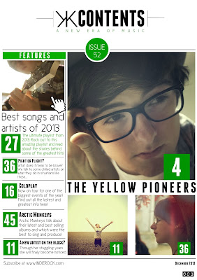
I used Q magazine to help design my contents magazine with the layout of writing and photo arrangement. I wanted to keep the same house style and the best way to do this would be to use the same magazine to help with designing. I've made the colour scheme easy to see in the contents page by using it to highlight titles, page numbers and the issue number. Most of my media conventions are on my contents page as I believed it made it look neater that to have it all crammed onto the front cover. These media conventions consist of page numbers, issue number, date and a link to the magazine's website. When you look at the page I used above, it isn't identical as that would be copying, but is very similar in the way the page numbers have been laid out and the sub-title 'features' is similar. I liked the way they had every image or piece of information in line with on another. This makes it easier to read and makes it more aesthetically appealing for the buyer. I decided to fit more images on the page to be able to fit more information on the page, given that my front cover doesn't have as much information as other music magazines.
Another conventional media point in my contents page is the image of the artist playing the guitar. Many images have been used in the past of an upwards or downwards shot of a guy playing guitar. This therefor makes this a stereotypical shot and fits in well with the genre of my music magazine.I also used all my own images which of course is what a music magazine would have to do otherwise it would be involved in copyright issues. I made sure that the main article was the biggest image to get the greatest attention from my audience and then other articles around it but with smaller or no images.


Finally, my double page spread follows the typical conventions of a music magazine's double page spread. These are: a main image of the artist/band, title of the band, quotations and columns of writing. I follow all of these conventions in my double page spread, therefor giving it a typical layout of a magazine. I kept the same font that I had used for my front cover and contents page, giving it a consistant house style through out the magazine. I took inspiration from Q magazine by using a giant letter behind the columns which gives an interesting layout for the interview. I also added a few quotes, one on the image to the left and on in the bottom right hand corner to draw the reader in. With the photo I tried to make it look slightly vintage to keep to the house style and to match the genre of music in the magazine.