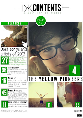
I used Q magazine to help design my contents magazine with the layout of writing and photo arrangement. I wanted to keep the same house style and the best way to do this would be to use the same magazine to help with designing. I've made the colour scheme easy to see in the contents page by using it to highlight titles, page numbers and the issue number. Most of my media conventions are on my contents page as I believed it made it look neater that to have it all crammed onto the front cover. These media conventions consist of page numbers, issue number, date and a link to the magazine's website. When you look at the page I used above, it isn't identical as that would be copying, but is very similar in the way the page numbers have been laid out and the sub-title 'features' is similar. I liked the way they had every image or piece of information in line with on another. This makes it easier to read and makes it more aesthetically appealing for the buyer. I decided to fit more images on the page to be able to fit more information on the page, given that my front cover doesn't have as much information as other music magazines.
Another conventional media point in my contents page is the image of the artist playing the guitar. Many images have been used in the past of an upwards or downwards shot of a guy playing guitar. This therefor makes this a stereotypical shot and fits in well with the genre of my music magazine.I also used all my own images which of course is what a music magazine would have to do otherwise it would be involved in copyright issues. I made sure that the main article was the biggest image to get the greatest attention from my audience and then other articles around it but with smaller or no images.
Finally, my double page spread follows the typical conventions of a music magazine's double page spread. These are: a main image of the artist/band, title of the band, quotations and columns of writing. I follow all of these conventions in my double page spread, therefor giving it a typical layout of a magazine. I kept the same font that I had used for my front cover and contents page, giving it a consistant house style through out the magazine. I took inspiration from Q magazine by using a giant letter behind the columns which gives an interesting layout for the interview. I also added a few quotes, one on the image to the left and on in the bottom right hand corner to draw the reader in. With the photo I tried to make it look slightly vintage to keep to the house style and to match the genre of music in the magazine.


No comments:
Post a Comment